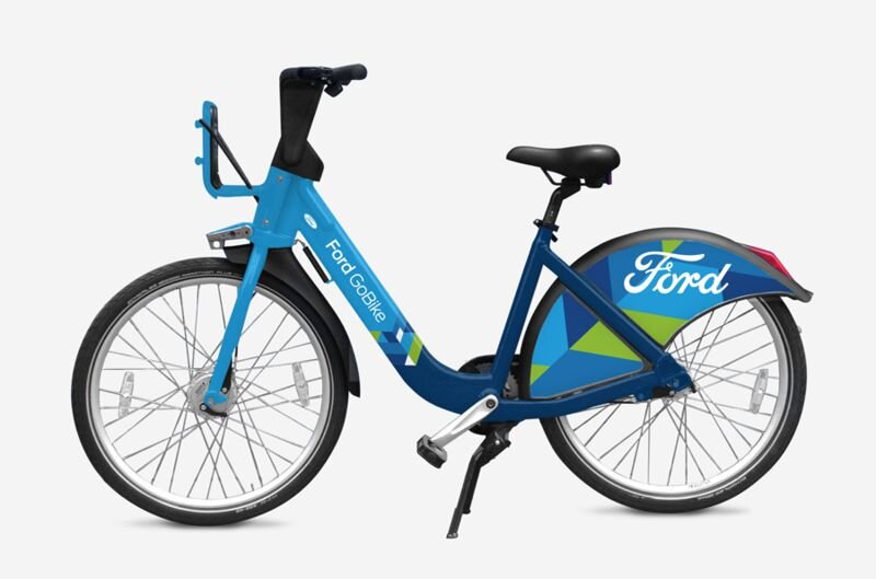
FORD GO BIKE

Transportation is also a issue in Major Cities. Bicycles provide a quick and easy way to cruise through traffic. It is always desirable to have an easy affordable mode of transport.
Brief:
Ford GoBike is the Bay area’s new bike share system with thousand of public bikes for use across San Francisco, EastBay and San Jose. FordGoBike is a personalized bicycle-rental app design that also focuses on the health aspect.
Goal:
Wants a quick and cheap ride
User friendly App
Increase ridership among first-time clients, particularly sightseers.
Challenges:
To get regular users in all seasons
Annual membership was rising much faster than casual membership (24-hour passes and 7-day passes) and stakeholders wanted to learn why and what could be done.
Research:
We shadowed and talked with individuals utilizing Fordgobike out of the blue to comprehend and get familiar with their agony focuses. We visited a large number of the bay area stations to utilized it for ourselves to be in the shoes of first-time clients and to watch pedestrian activity. we asked couple of questions to user.
How would they use their navigation profile
We looked at the three main platforms that needed to be enhanced. The focus was rider safety, ease of use, and awareness. The main enhancements were to kiosks, mobile app.
2.Notifying the user about nearby cycle stations (to drop the cycle) towards the end of the trip.
First Deliverable:
We shared out the exploration discoveries and openings territories, just as wireframes and Mocks to Ford Bike partners.
opportunity:
We knew an immediate win for Ford Bike would be to relook at the onboarding of first time users, which meant redesigning the kiosk sticker that is displayed at 330+ kiosk stations.
We had observed that the kiosk station was potential customers’ first touch point with Ford Bike. Thus, if they did not understand the instructions and the payment model, we had already lost them as customers.
Insights from the data:
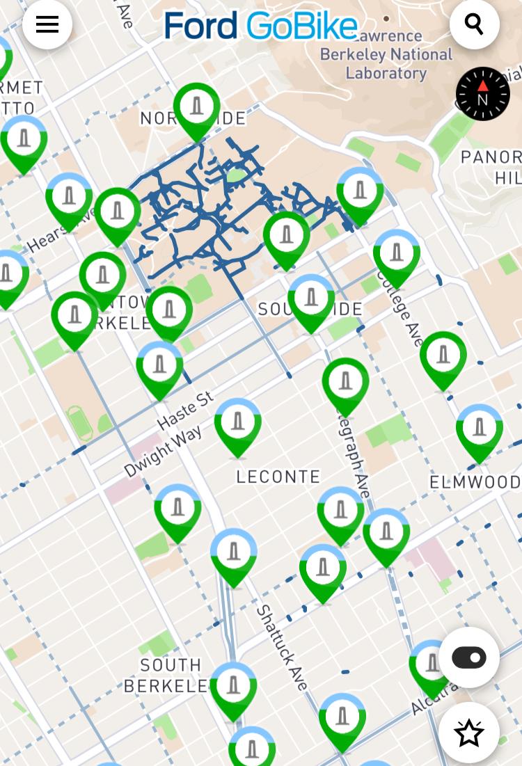
We parsed Ford Bike public system data, to find that casual ridership was highest on weekends and located the most popular first-time user stations.

Research findings:
• Frustrated and felt unsure of what to do first
• Overwhelmed by the length of the overall process
• Hesitation to try out, due to the hefty $100 hold on cc
• Screens seemed unresponsive
• Pressure to understand the system right away
• Confused on how to undock the bike
• Time limit and countdown to obtain a bike is overwhelming.

Takeaways:
#1: Single-day and one-week passes can only be purchased at a physical FordBike kiosk, which tends to attracts long lines.
#2: Once a user gets over the hurdle of purchasing a pass, the instructions on how to obtain a bike is confusing.
#3: The pricing model was a major point of confusion, especially those unfamiliar with bike share programs. This put a heavy barrier to entry for new users.
#4: The onboarding assumes that users are fluent in English and have the time to read through a lot of instructions.
Success criteria:
We knew our redesign needed to answer these 3 key questions:
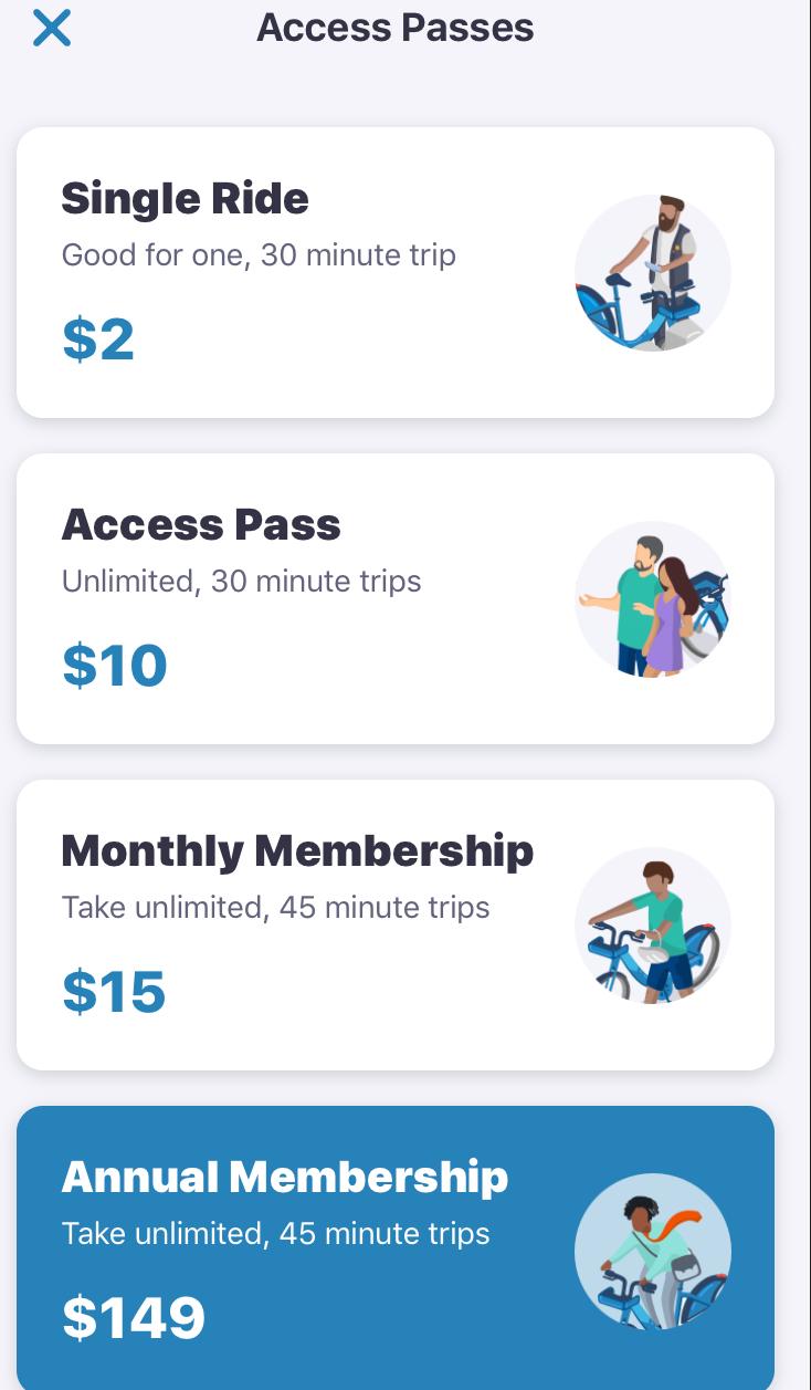
1. What do you get with a one-time pass? With a 7-day pass?
2. How long can I ride for?
3. And how do I get my bike out
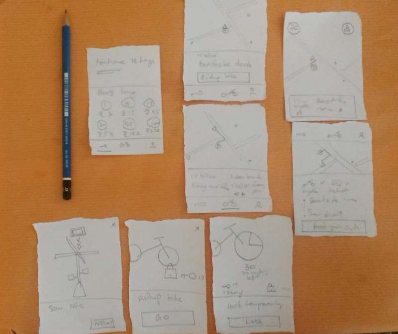
Brainstorm:
We sketched and whiteboarded how to explain the different payment models, as well as simplifying the instructions on how to undock a bike. With only the text, we did a card sort of all the words that were on the display.
Paper prototyping and usability testing:
Once we flushed out 3 design directions, we stuck our paper prototypes at highly visited Ford Bike kiosk stations. Also, we evangelized Ford Bike's outreach ambassadors team to conduct research for us, by testing out 3 different pricing models.


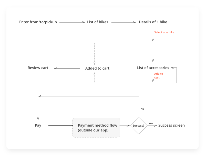
Wireframing
Using these decisions and the conversations I designed the low fidelity wire frames.
Home screen: Enter pickup, dates for renting, and bike type. Initially, I designed the screen this way
A quick user research with card sorting gave the realisation that if the home is kept as the main feature around which every feature is organised, it makes the map (the home) the primary focus. We want the user to percieve the map as a part of the home where booking the bicycle is the prime action and the map takes the back seat.
Post-relaunch:
Because Ford Bike publicly publishes their ridership data, we were able to track if there was an increase in first-time users
after the launch. We found a month after launch, ridership amongst one-time users increased by 14% (compared to the previous month).
In July, the month prior to the design launch, there were 42,300 one day memberships and 3,530 seven day memberships. During the month of install, there were 48,086 one day memberships and 3,658 seven day memberships in August .